Opened 8 months ago
Last modified 3 months ago
#19403 assigned enhancement
Add structure coloring controls to mutation scores scatter plot
| Reported by: | Tom Goddard | Owned by: | Tom Goddard |
|---|---|---|---|
| Priority: | moderate | Milestone: | |
| Component: | Structure Analysis | Version: | |
| Keywords: | Cc: | Willow.Coyote-Maestas@…, Elaine Meng, Matthew.Howard@… | |
| Blocked By: | Blocking: | ||
| Notify when closed: | Platform: | all | |
| Project: | ChimeraX |
Description
Willow suggested adding controls to the mutation scores scatter plot to color associated structures. These would allow doing simple coloring of residues using attributes computed from mutations scores without needing to use the Render by Attribute GUI.
Attachments (3)
Change History (18)
comment:1 by , 8 months ago
by , 8 months ago
| Attachment: | scatter_color.png added |
|---|
Screen snapshot showing some new coloring controls on scatter plots.
comment:2 by , 8 months ago
Willow suggested the following refinements to the current coloring controls:
Mapping the sum ended up with negative scores and was confusing for the coloring. Get rid of the sum and just keep the sum absolute value.
Currently, if you drag a box in the scatterplot, the color mappings go away. It’s set up where the box dragging colors the structure green. Probably make it so it just selects doesn’t change color.
Default setting to select ‘color missing values: white’ (this adjusts the default from grey). This will reduce the problem of ending up with leftover colors from previous scores.
Adjust color scale to have more steps and not to max out. I think doing this based on percentiles would be helpful:
Pasted Graphic 1.png
Add new default color scales
Red-white-blue. This would have white be a band centered at zero. Then red and blue have multiple steps. Here is an example of roughly what i think would be ideal.
Pasted Graphic 4.png
Adjust naming scheme current with the drag box these become quite long and confusing:
Pasted Graphic 2.png
We probably need some sort of attribute manager that allows removing these or rapidly switching between them.
comment:3 by , 8 months ago
| Cc: | added |
|---|
Made several improvements to the structure coloring:
1) Replaced two color white-red and white-blue with three color palettes still using linear ramp.
2) Added red-white-blue color palette for handling signed residue values such as mean or median across full set of mutations. This uses 4 levels with the two middle ones being white using (0.66*min, 0.33*min, 0.33*max, 0.66*max). Not a great choice for thresholds.
3) Added different ways to combine mutation scores for a residue: median, count, max, min.
4) Use while color if residue does not have a score.
5) Make ctrl-drag on scatter plot select residues by default and not color them green.
comment:4 by , 8 months ago
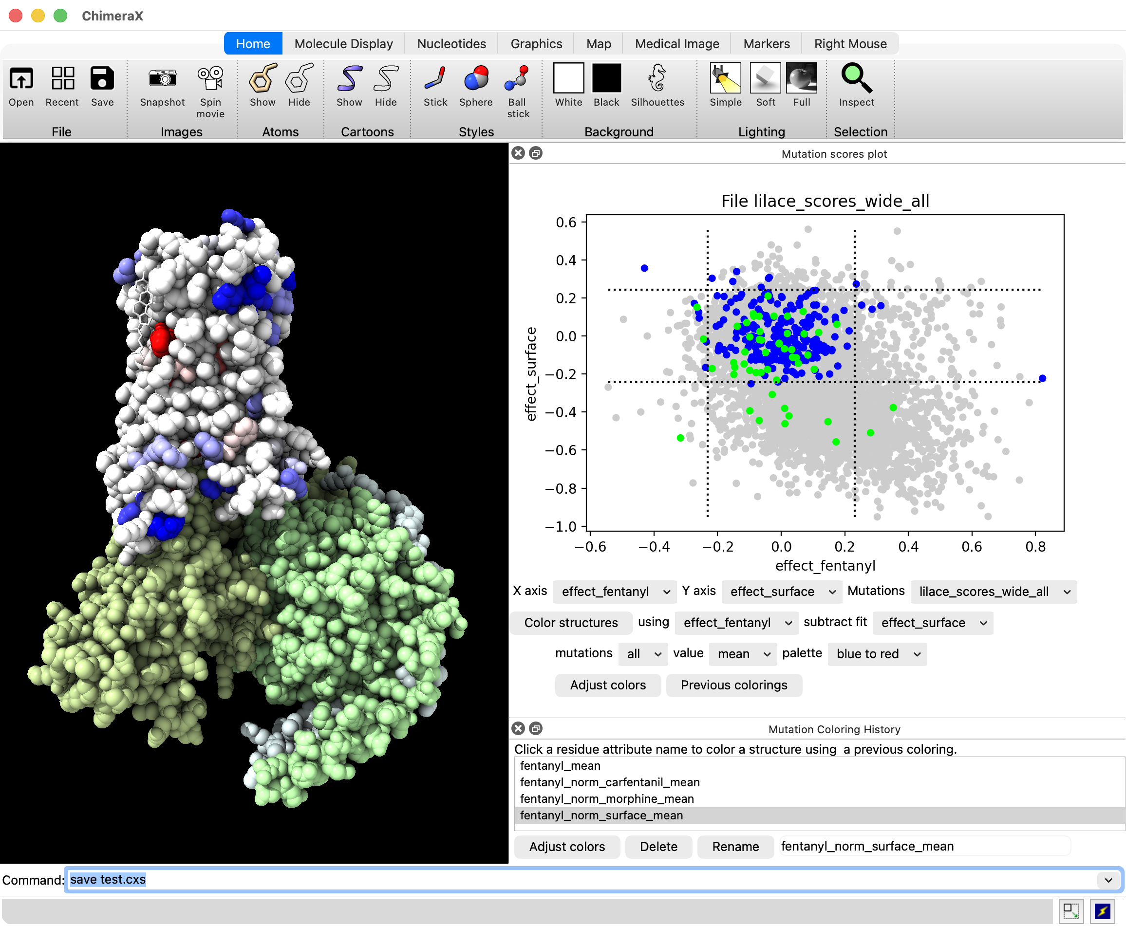
6) Added a Mutation Coloring History panel and a button "Previous colorings" on mutation scatter plots to show it. Clicking the attributes in this panel sets the coloring on structures. Colorings created by the mutation scatter plot are remembered as well as colorings created directly by typing a color byattribute command that uses a mutation score attribute. The colorings and attributes are remembered in sessions. This gives a quick way of switching between many different colorings. Having many colorings is common when the mutation data contains many assays, for instance with the opioid receptor data where receptor activity values for a dozen different drugs are available. There is an "Adjust colors" on this panel that shows the render by attribute panel for the chosen attribute in the list so that colors and thresholds can be changed.
I'll attach a new screen shot of the scatter plot controls and new coloring history panel.
by , 8 months ago
| Attachment: | mut_color_history.png added |
|---|
Screenshot of new mutation color history panel.
comment:5 by , 8 months ago
Willow tried the coloring controls and had the following suggestions:
Improvements for the mutation color history panel:
1) Make a multi-column table instead of a list of attribute names and remove the drag box ranges from the attribute name and put them in a separate table column.
2) Remove the method of combining mutation scores (mean, sub absolute) from the attribute name and make it a separate column in the table.
3) Allow renaming residue attributes to custom names, possibly by double clicking the name in the table as is done in the Models panel to change model names.
4) Add ability to delete residue attribute from table (and delete residue attribute itself).
5) Have residue attibute table setting that sets scatter plot axes and colors drag box green when user clicks a table row.
6) Add attribute table option to only color displayed structures. This will allow coloring only a fentanyl bound structure with fentanyl scores, and a morphine bound structure with morphine scores even though both structure are associated with all the mutation data.
7) When box is dragged along full width of one axes on scatter plot, don't include that axis in the attribute name or the drag bounds.
8) When box is dragged to the edge, for instance all scores < -0.2, don't include the lower bound score (e.g. score > -3.5) in the the attribute table bounds column.
Scatter plot coloring control changes.
9) Fix drag on scatter plot not clearing previous green color mutation points when the axes have been changed.
10) Might be useful to show scatter plot colored by point density, instead of mono-color. This could also possibly help speed up rendering plot when switching axes which now takes a second or more.
11) Add option to subtract least squares fit before taking mean, sum absolute, ....
General issues:
12) How to do colorings with just a single score per mutation (ie single phenotype). Possibly scatter plot could still be used showing score on y axis, residue number on x-axis. Or maybe coloring controls would be added to histograms.
comment:6 by , 8 months ago
A few more suggestions from Catherine Shin in Willow's lab:
13) It would be nice to be able to export the scores once they are calculated as a csv. Perhaps there could be a button in the score manager table for this.
14) She really loves your residue mini heatmaps. But she was unsatisfied with the ordering the amino acids. After going back and forth we came up with:
HRKDE
FWYNQ
ILCST
VMAGP
comment:7 by , 6 months ago
| Cc: | added |
|---|
I added a Delete button and Rename button to the mutation coloring history panel, and added a subtract fit menu to the coloring controls on the mutation score scatter plot. These are items 4, 3, and 11 above. I'll attach a screenshot of what these new controls look like.
The Rename button has next to it an entry field to edit the name. You click a score name in the list and it fills in the current name, then you edit the name and click Rename. To delete you select a list entry and press Delete.
The subtract fit gui menu lists the score names. If it is not "none" then a linear least squares fit is made using the coloring mutation scores and subtract fit scores, and the linear fit value is subtracted from the coloring scores before computing the residue score. This is exactly the same as the subtractFit option of the mutationscores define command and it works by using that option.
by , 6 months ago
| Attachment: | chimerax_dms.png added |
|---|
Screenshot of the Delete, Rename, and Subtract Fit options added in comment 7.
comment:8 by , 6 months ago
Added a Save .csv button to the mutation scores coloring history panel. This is request 13) in comment 6 above. One or more coloring attributes can be selected and they are saved in .csv format with columns "residue number", "residue type", score1-name, score2-name, ....
comment:9 by , 6 months ago
| Cc: | added |
|---|
Matt Howard wants "red to white" and "blue to white" palettes. The "white to red" and "white to blue" color palettes were intended for all negative or all positive scores and the thresholds for each color were automatically set for that case. It would not make much sense to add "red to white" which flips the colors so red would be low value and white high value for all positive values. I take this to mean the bizarre behavior of the current color palettes was not intuitive. So I have changed the palette behavior to be more intuitive as follows.
The palette name (blue to red, white to red, red to white...) always indicates the order of the colors from low to high (signed) values. The thresholds used always span 4 standard deviations from the low to high color centered on the mean value. The blue to red and red to blue schemes actually are 4 colors each blue-white-white-red while the white to blue/red are just two colors.
I added the red to white, and blue to white palettes to the scatter plot palette menu.
comment:10 by , 4 months ago
I removed the coloring controls from the mutation scatter plot and put them in there own panel. To show the coloring controls clicking on the scatter plot and choose the new menu entry "Show structure coloring panel".
I also made pressing the "Color structure" button not automatically remember the coloring since that leads to too many not useful colorings. Instead you have to enter a coloring name and press a new "Name" button to remember the coloring.
I haven't tested these changes as much as I would like, so there may be some rough edges. But I put it in the daily build. Tomorrow I'll do some more testing.
The next change is I will add some filtering controls to filter by mutation score on as many scores as you like. Currently the graphical user interface lets you filter by a region of scores dragged on the scatter plot. But that only allows filter two different scores, and the new controls will allow filtering on as many as you like.
comment:11 by , 4 months ago
In today's build, whenever I click "Name" to save the current coloring, it seems to overwrite any previously saved colorings, i.e. the Mutation Coloring History only lists one thing even when I've saved multiple different names.

One question: does clicking Name remember the coloring settings in the dialog regardless of whether they were applied, or does it only remember the current coloring that has already been applied?  I suspect the latter... but one workflow could be to adjust settings and save a name before  actually applying.  Maybe that's a dumb workflow, however, since I am not actually doing this kind of analysis.  :-)
comment:12 by , 4 months ago
Oops! Sorry, I am changing the mutation color naming today. The Name button is supposed to allow you to save different colorings using different names. Please postpone documenting until I add another comment saying the naming has been revised. I may get it done today.
comment:13 by , 4 months ago
I made the color structures button create a Residue attribute name "mutation_score". Then if you name that coloring it also renames the Residue attribute to match the coloring name.
The named colorings GUI is still bad. There are two GUIs, one to create a mutation score coloring of residues and optionally name the coloring, and a second that lists the named GUIs. It seems like the list of named colorings should be part of the coloring creation GUI. Currently there "Adjust coloring" buttons in both GUI panels, and the ability to name and rename in both panels. And there is no way to see for a named coloring what palette, score combining method, filtering, subtract fit, ... were used. Seems like selecting a named coloring from the list might populate the coloring creation dialog with the settings for that coloring. But filtering and palette settings can't always be represented in the coloring creation panel. More thought is needed to figure out how or whether to combine the two panels. Maybe I'll defer that problem and add the multi-score filtering controls next.
comment:14 by , 4 months ago
I added a GUI panel to name mutation score ranges, for example you could name "strong agonist loss of function" or "strong agonist LOF" to mean high scores for DAMGO, Fentanyl, Carfentanil, SR17018, then use that in the mutation structure coloring gui where it will appear in "filter mutations" menu. There is a "define ranges..." entry in the filter mutations range that is used to show the new GUI (currently the only way to show it).
This is an initial implementation for Willow to try. Not ready for documenting.
comment:15 by , 3 months ago
I made the mutation structure coloring "define ranges..." option use the ranges set in the GUI even if those ranges are not given a name. This avoids the 2 extra steps of having to name the ranges, and then having to change the coloring filter menu to use that name. Also it allows changing the filter ranges and coloring several times until you get something you like before naming the ranges.
I implemented color controls on scatter plots as shown in the attached image.